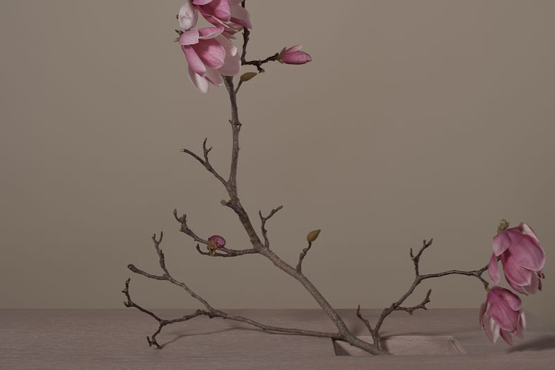
Design daily is not big on self promotion but occasionally a completed project has the right elements to make an interesting post. Working with Sydney architect Daniel Boddam to produce a catalogue for his small collection of furniture called Monument was a great opportunity to move away from conventional room styling to something with a strong stylistic focus. The pieces in the Monument collection needed to be the heroes but the other objects in the shots needed to have the right combination of simplicity and geometry to show how Boddam's understated, classically informed designs could be contemporised to fit into a range of interior environments.
Daniel Boddam is a Sydney architect who has observed the need for furniture in his projects that are low-key and enduring. While the majority of contemporary furniture seeks to make a statement and be noticed, the designs Boddam has developed as one-off pieces for clients and in the Monument collection are extremely quiet. Inspired by landscapes and ancient buildings while on an extended trip through Europe and the Americas, Boddam designed the items in the Monument collection with a strong emphasis on geometry and an overt sense of materiality.
While the M-chairs, shown above, are quite classic in style, a great deal of attention has been paid to optimising the small details - from the rake of the backrest to the precise seating height and level of upholstery comfort required for the often lengthy periods people spend around a dining table.
The M-table was initially inspired by the Temple of Kukulkan in Yucatán, Mexico and features a wedge shaped base in oak that radiates in four directions. Both massive and sculptural the architect drew on his love of the work of Brancusi to streamline the shapes and connection of materials.
The brochure for Monument was a collaborative effort with the main photography shot by fashion photographer Kelly Geddes while Craig Wall produced the clean product shots to outline the various finishes and material options available. Brochure design was by Sydney based graphic designer Paulina Paige Ortega and Karen McCartney of Edit'd was the creative consultant on the project and guided the overall look of the brochure.
Styling a collection of furniture items requires decisions about what objects and accents should be used that subtly reflect the desired mood of the collection and in this case the look of the brochure. The use of Porcelain Bear's I-O-N pendant lights was enthusiastically embraced by the Daniel Boddam team as the lights combined simple geometry with a high calibre material - porcelain. The I-O-N range comes in three shapes (the third one being an inverted 'U') and while options were shot with the three pendants hanging together, the image that worked best involved just two.
Porcelain Bear were kind enough to lend unglazed I-O-N pendants for the Monument shoot - not something that is normally part of their offering but the extremely matt quality of unglazed porcelain was felt to be the most appropriate choice. Porcelain Bear was founded in 2010 by ceramicist / designer Gregory Bonasera but shortly after became a partnership between Bonasera and industrial designer / ceramicist Anthony Raymond. The duo have a beautiful studio and showroom in Melbourne's Collingwood where they create not only delicate lighting fixtures but also accessories and quite massive furniture pieces - all in porcelain. You can learn more about their work on a previous Design daily post here. The 'Cloche' pendant light and 'Metro' dining table shown below, give some idea as of the textural variations and different scales Porcelain Bear are capable of achieving.
Sydney based lighting and furniture design studio Anaesthetic was another Australian company selected to accessorise the Monument shoot. In this instance it was the aged brass finishes and extremely simplicity of their 'Constellation' lighting that was chosen to bring out the materials in the M-table in American oak and brass. The 'Constellation' comes in variations that range from 2 brass bulb holders on a single cross bar to a minimal chandelier with 6 bulb holders - 3 to a bar. The intersection of the bars is left up to the user and through playing with heights and angles a large number of variations are possible.
The 'Duomo' wall sconce and 'Duomo' rocking table/floor light shown above, are examples of other recent additions to the Anaesthetic lighting collection. The table /floor light is weighted with lead shot so different positions can be achieved from vertical to horizontal despite the domed shape of the shade.
The studio is based in Camperdown in Sydney's inner west and was founded by husband and wife duo Ben and Kiri Wahrlich in 2011. The New Zealanders have shown their simple, material led designs at trade fairs and exhibitions such as Sydney InDesign, Workshopped, Designex and Melbourne's DenFair as part of the young designer platform ID. x THE SNAP.
You can see more of the Monument Collection by Daniel Boddam here.
Thanks to Fred International and Cult for the loan of accessories from By Lassen, Friends & Founders and Hay.


