After a slight hiatus, D.d presents the best of London Design Festival installations. As usual the V&A hosted a number of wonderfully inspiring installations set among their objects and antiquities while another ancient building - Somerset House, played host to 10 designers in it's West Wing along with a number of group and commercially sponsored installations in the South Wing. The quality was a little variable but there were enough of a high standard to warrant several posts. While most were in these two impressive institutions there were a couple of interesting installations shown at other venues including the work of Katharine Morling at Future Heritage at Decorex in Syon Park and the awesome 'Pylon' by Alex Chinneck on some waste ground on the edge of the river at Greenwich.
Within the palatial environs of 18th century Somerset House, 10 designers presented installations through the West Wing, including Alex Rasmussen's anodised aluminium 'The Wave' structure shown below.
The form was made in modular sections in Rasmussen's L.A factory, Neal Feay, and sent by FedEx to London for assembly. The shimmering structure made up of over 700 individual panels could be walked and slid upon (In protective booties) as if surfing an interior wave and presented a dynamic contrast to the traditional elements of the room with its parquet floors, grand windows and over-scale doors.
Other less conceptual works on show included Nendo's clever expanding shelf system 'Nest', Ross Lovegrove's new 'Muo' wireless sound system for British speaker manufacturer KEF and Luca Nichetto's 'Alphabeta' lights for Hem. The later were linked to an electric piano and something like 40 variations of the light turned on and off in a sequence according to the keys struck by the pianist. More visually interesting installations were presented by Israeli designer Arik Levy in collaboration with Turkish architecture studio Tabanilioglu Architects and by British consultancy Patternity (see an earlier D.d post on Patternity here).
Using their signature combination of graphic black and white patterns in the form of spots, lines and squares, Patternity produced a complex installation in the style of an avant-gard theatre set - complete with people popping in through holes wearing clothing in even more examples of monochromatic pattern.
Arik Levy has been experimenting with fractal shapes for many years and in the "warm light room" of the TransitionWarmWet installation, he created a cloud of light from 960 LED strips held in position on an aluminium frame by countless cable ties. In the adjoining room Turkish architects, Tabanilioglu created a contrasting "cool wet room" called 'Solidpool', consisting of two slowly oscillating tables covered in water droplets. While the tables moved in a slow see-saw motion, the droplets magically remained stationary.
In the Stamp staircase of Somerset House, London based design engineer, Nassia Inglessis created an installation called 'Spine' that was based around the new Plumen 002 LED bulb - 132 of them - in a clever interpretation of the human spine. The bulbs interlocked snuggly into a chain that was akin to an oversized vertebrae running over two floors. Each bulb was on a dimmer and interacted with the movement of people up and down the staircase in a way that was designed to reflect how electricity flows through the human body. The installation was created with Studio Ini. For more go to the Plumen website but also check out Inglessis' other interesting interactive work here.
One of the most beguiling installations at Somerset house was 'The Drawing Room' by British designer Faye Toogood. While the installation was already within the walls of a grand building, she chose to recreate the genteel traditions of the English drawing room by literally drawing it onto huge bolts of cloth. These fabric drops totally covered all aspects of the space, forming an imagined environment complete with all manner of decorative objects. Visitors were invited to relax in an environment that evoked a derelict country house. The looseness of the hand drawn was in fascinating contrast to the bold patterns presented by Patternity and Paperless Post and the way real objects were set within the drawn background created a wonderfully theatrical but quiet air as if a play was about to start at any minute.
The South Wing of Somerset House was also home to a couple of great installations including Max Lamb's 'My Grandfather's Tree'. Like Lamb's zen-like circle of chairs installation shown at 5Vie in Milan last April, this installation had a palpable monastic quality. The room lent itself to this feeling but it is the way in which Lamb positions his pieces that really elevates each object to another level. In this instance the objects were sawn trunks and branches from a tree Max Lamb felled on his grandfather's property, Monkton Walk Farm in Yorkshire.
'My Grandfather's Tree' was the result of a seven-year project in which Lamb worked to preserve and extend the life and legacy of his grandfather's ash tree that had started to rot in 2008. Lamb decided to offer it a new life as sculptural object and cut the tree into 130 pieces that were presented as a collection of stools, tables and chairs. The importance of materials are once again the focus of Lamb's work, with the tree's 187 annual growth rings clearly visible in the larger pieces emphasising the need for care and reverence for such a slow growing and precious commodity.
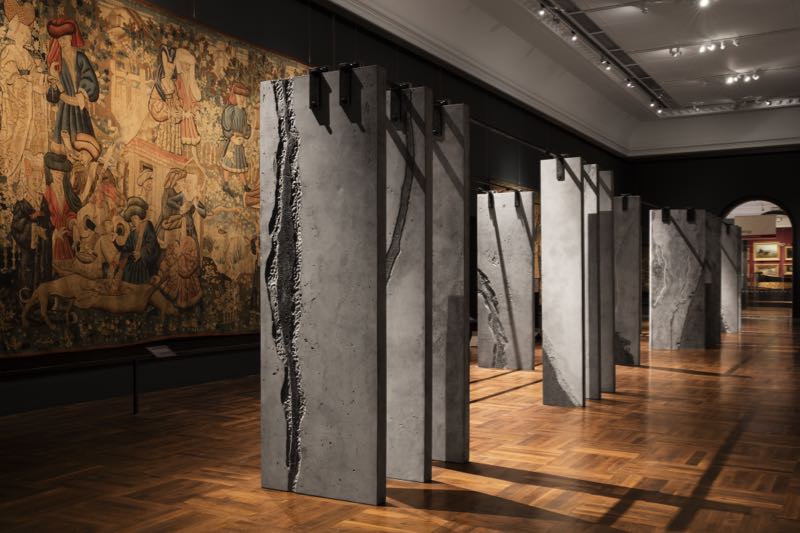
Not disimilar in feeling was the 'Ogham Wall' installation by Dublin based Grafton Architects on show in the Tapestry Gallery within the V&A. Yvonne Farrell and Shelley McNamara, founders of Grafton Architects wanted to translate the Irish Ogham alphabet into an architectural work. They used 23, three metre high slabs of cast concrete to represent each letter of the alphabet. These giant fins were cast by concrete specialists Graphic Relief with each one incorporating magnified and abstracted bark patterns as each letter in the the Ogham alphabet references a particular species of tree. The tactile element introduced by the process referenced the textures found in the tapestries that hang on the walls of the Tapestry Gallery.
The work of Faye Toogood was also on show at the V&A with an installation called 'The Cloakroom'. For this installation she collaborated with her sister Erica in creating 150 coats from a Kvadrat foam fabric by Raf Simons called Highfield. The two sisters have been working on a fashion label called Toogood together for the past two years and the visitor coats are based on the label's oil-rigger coat.
These coats, artworks in themselves, were designed to be worn by visitors to the V&A and were available from the cloakroom. Each coat featured a different hand painted motif on its back and included a sewn-in map of 10 spots within the V&A that had been chosen by the Toogood sisters as areas of special interest.
In each of these locations a coat designed by the designers and made in a special material that reflected its location could be found - one in carved wood, another in marble, another totally clad in rivets.
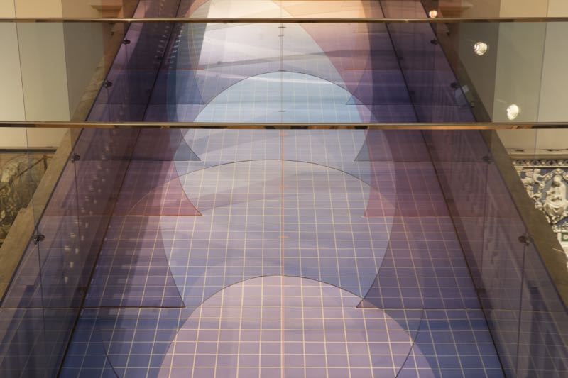
Also at the V&A, London based designers Laetitia de Allegri and Matteo Fogale collaborated to create a new version of the bridge that spans the space above the Medieval and Renaissance Sculpture Gallery. Made from sheets of vertically suspended perspex the new tunnel-like structure called 'Mis en Abyme' introduced subtle colour and shape into the monochromatic plaster and stone museum environment.
The addition to the bridge forced people to walk in the centre or duck their heads to avoid collision with the off-centre curved shapes. Named 'Mis en Abyme' (which translates to 'placed into the abyss'), the installation encouraged viewers on the lower level to look up and admire the awe-inspiring spaces within the V&A and was inspired by a combination of the prevalence of stained glass during Medieval times and the invention of perspective in art during the early Renaissance.
Below in the sculpture gallery British artist and designer, Barnaby Barford created an installation of 3000 bone china miniature shops stacked high in a biblically proportioned 'Tower of Babel'. Barford rode his bicycle over 1000 miles photographing shop fronts from each of London's postcodes for the installation. After compositing the images and creating decals of each of the shops, the bone china objects were made in Stoke-on-Trent by 1882 Ltd.
Assembled into 6 metre high tower, the work sits curiously well among the classical sculptures of the Medieval and Renaissance Sculpture Gallery. A comment on the favourite pass-time of Brits - shopping - the work is a reminder of the changing face of the London high street, documenting everything from dilapidated suburban shops to high end fashion and jewellery stores. All the shops are available for purchase (although most have quickly sold) through a dedicated website with prices ranging from just under £100 for the more decrepit ones to around £6000 for the most impressive upmarket stores. A blog that documents the process is part of the website and includes a 'shop of the day' that incorporates a potted history or comment on each shop. For more go to the Tower of Babel website.
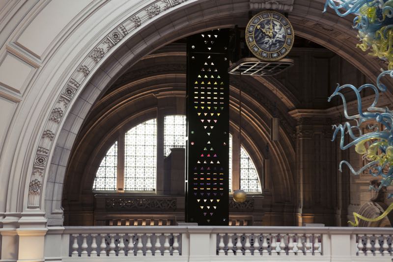
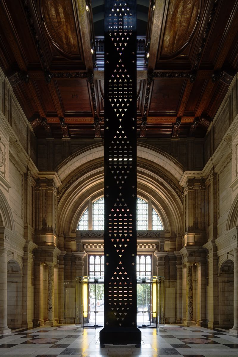
Norwegian born designer Kim Thomé partnered with Swarovski to create an even taller structure for the grand entrance area of the V&A. 'Zotem', an amalgam of the terms 'Zoetrope' and 'Totem', extends six floors into the museums ceramics gallery on the very top floor.
Made of two sheets of steel, the structure envelopes over 600 crystals that reflect colour and light through rectangular, circular and triangular cut-outs. A coloured pattern runs behind the crystals at a set speed that creates the illusion of vertical movement. It is as if the colour is being pushed up from the basement. Thomé left the sides of the structure open so that visitors could learn how the process worked and watch as the crystals transformed and relayed the passing colours.
As a device to make visitors more aware of the hight of the spaces within the V&A, 'Zotem' couldn't be improved upon. Everything about the installation emphasises verticality and upward force. Its narrow profile allows it to slice right through the floors joining the different levels with a common material and colour palette.
Mischer'traxler (Katharina Mischer and Thomas Traxler) created an installation called 'Curiosity Cloud' that suspended hundreds of droplet shaped vessels in glass from a minimal structure. Commissioned by French champagne house Perrier-Jouët for whom Mischer'traxler have created a series of works called Small Discoveries, each of the 250 glass orbs enclosed a tiny insect from 25 species including butterfles, beetles or dragonflies. These species represented three groups - the common, the extinct and the recently discovered. From a distance the work in combination with the highly decorative gilt-tinged interior of the gallery space, created a feeling of delicate opulence - as if the room belonged to an imaginary monarch with immense good taste. Moving closer the insects became more visible and moved more frequently changing the perception to a more obvious reference to a museum's role in the conservation of objects and animals.
The mouth blown orbs made by Viennese glass specialist Lobmeyr, are capped in spun metal that provide a light source and a tiny motor to drive the movement of the insects held within. The motors and lights were triggered by movement in the room and ranged from the subtle movement in a few orbs to frantic flying in increased numbers as visitors moved closer. Each of the insects was an artwork in itself, laser cut from coloured metal foil with hand embroidered bodies. A video on the concept and creation of the installation can be seen here.
To prove that the V&A during the London Design Festival isn't totally given over to conceptual art pieces, the museum also commissioned an exhibition / installation 'Works in Wood' covering the works in timber of legendary British designer Robin Day. The installation design was taken on by London architects Assemble and consisted of a "forest" of solid timber plinths in varying sizes that each supported one example of Day's explorations in timber. These ranged from precisely formed and mass produced plywood chair shells to quite basic hand made pieces crafted by Day himself.
Famous 1950's designs such as his 'Royal Festival Hall' and 'Hillestack' chairs were included along with one-off pieces such as walking sticks, slingshots and a birdhouse. Situated in the open 1500-1900 Gallery space with its expanse of stone, the small timber objects popped out from the monochrome background with surprising power.
Having featured so many interior installations it's probably healthy to get outside into the fresh air and see an installation in a different context. Hackney artist, Alex Chinneck created a new work for LDF15 on the banks of the river thames in Greenwich called 'A bullet from a shooting star'. Otherwise known as 'Pylon', the work resembles an electricity pylon but is in fact engineered completely differently so that it can support its own weight upside down.
Anchored to the earth with a massive 150 ton counterweight buried under earth and rubble, the structure was inspired by the nearby gasworks tanks with their latticed metal framework. Situated on the former site of an artillery works - hence the 'bullet' part of the name - the sculpture looks as if it has been shot from outer space, landing just beside the Millennium Dome. Chinneck is well known for his architectural sculptural works that create strange new ways of seeing everyday things - from a building with a facade that has slumped onto the ground in Margate to a levitating building in the middle of Covent Garden's piazza. The 'Pylon' installation was commissioned by Hong Kong developers Knight Dragon on a site that will later be developed into 15,000 new homes. A video of the making and installation of 'Pylon: A bullet from a shooting star' can be seen here.
The design and decoration fair Decorex at Syon Park hosted Future Heritage for the second year this year and as part of this artist Katharine Morling produced an installation in porcelain that recreated an old world writer's environment complete with typewriter, chair, pencils and scissors - all hand made in porcelain. Morling specialises in the realistic recreation of everyday objects in matt unglazed porcelain. She recently presented a large body of work at the Shipley Art Gallery that featured life-sized chairs and tables in porcelain - all in her signature hand drawn aesthetic in white with black edging.
To finish off this post, Raw Edges created a site specific installation of their 'Endgrain' benches and stools (featured in last week's Design daily post on LDF 2015 new products) in the 19th sculpture gallery within Chatsworth House - the home of The Duke and Duchess of Devonshire in Bakewell in Derbyshire. As soon as Yael Mer and Shay Alkalay of Raw Edges were commissioned to create an installation in the sculpture gallery, they became fascinated with introducing colour to its monochrome palette. They decided to create an installation that would merge the Engrain furniture pieces and their earlier experiments in coloured flooring for Stella McCartney.
The result is a room of classical sculptures surrounded by a carpet of coloured parquetry from which benches and stools seem to sprout like harlequin mushrooms. Red and green were chosen as the core colours to reflect the mosaic tiles found in the plinths of the sculptures in the gallery. Remember that these are all fashion from individual timber blocks, individually stain before being laminated together.
Quite amazing.
And that, as they say is that. The installations of the London Design Festival 2015 in a Design daily nutshell.


